Portfolio Website
Web Development Showcase
Project Overview
This portfolio website is a comprehensive showcase of my skills, projects, and experience as a developer. Built as a semester-long project for my Web Development Engineering class at CSUF, it features responsive design, interactive elements, and an organized structure to effectively communicate my work to potential employers and collaborators.
Technologies Used
Core Technologies
- HTML5
- CSS3 with Media Queries
- Vanilla JavaScript
- Chart.js for Data Visualization
Design Approach
- Mobile-First Responsive Design
- Consistent Color Scheme
- Custom Typography
- Modular Component Structure
Implementation Details
Site Architecture
- Template-Based Page Generation
- Custom Layouts for Different Content Types
- Component-Based Structure
- Content/Code Separation
Responsive Design
- Separate mobile/desktop CSS files
- Device-specific component layouts
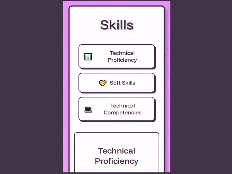
- Adaptive chart displays on Skills page
- Thoughtful space utilization across viewports
Responsive Design Highlight
One achievement I'm particularly proud of is the mobile/desktop responsiveness implementation on the Skills page. Rather than simply rearranging elements, I created completely separate HTML structures with tailored interaction models for each device type. Desktop charts use hover interactions with "Hover to see data" prompts, while mobile versions use touch interactions with "Select to see data" instructions. This device-specific approach delivers truly optimized experiences without requiring JavaScript to restructure the page based on screen size.
Desktop Layout

Mobile Layout
Challenges Faced
Responsive Navigation
Creating a navigation system that works seamlessly on both mobile and desktop
Implemented separate mobile and desktop CSS files with device-specific navigation patterns that maintain consistent user experience
Content Organization
Structuring diverse content including projects, blogs, and artwork in a cohesive way
Developed a unified card-based interface with consistent styling but flexible content display options
Performance Optimization
Ensuring fast page loads despite numerous images and interactive elements
Utilized optimized images, modern CSS techniques, and efficient JavaScript to maintain responsive performance
Key Features
User Experience
- Interactive Hover Effects
- Smooth Scrolling Navigation
- Consistent Design Language
- Accessible Color Scheme
Technical Features
- Dynamic Data Visualization
- Modular Code Structure
- Content Component Reuse
- Custom Table of Contents System
Future Enhancements
- Dark Mode Toggle
- Progressive Web App Features
- Blog Post Search Functionality
- Interactive Project Demos